Cross-cultural design is more relevant today than ever before, with more and more companies expanding their customer base across national and cultural boundaries.
To be successful in the new target market, global brands must consider linguistic and cultural differences for both offline marketing materials and also online assets, such as website and landing pages.
Design elements that move us to visit a website or to buy a product are as culturally unique as the languages we use. If you are looking to create a global website, or even to just localise your existing website into one or two additional languages, you might be thinking of simply translating your web content and “recycling” the existing design and visuals. However, the process is not quite as easy as that…
Read on to find out the key Dos and Don’ts you must keep in mind for effective cross-cultural website design.
Multilingual website design
So, why isn’t translation of web content enough to guarantee the success of your website among the new target audience?
A user may be able to understand the website copy if you simply translate it, but they will also be interpreting the entire website based on their cultural background and their values. And if something is at odds with their culture, or the technology is out of place, then their user experience might be negative and you risk losing them as a customer, or worse, alienating the whole of your new customer base.
How can this be avoided?
Website localisation
During the design process, the website must also be localised. Whilst website translation simply consists of translating your content into a new target language, website localisation entails making any design changes that are necessary to ensure that the site and the products or services it presents are both culturally and technically suitable for the target culture.
When it comes to cross-cultural web design, ignoring the following aspects may prove a costly mistake for a brand:
1. Text expansion and contraction
Did you know that French and Spanish expand by approximately 15%-30% when they are translated out of English? And that for German this figure can rise to 35%, or even more?
As a general rule, most languages take up more space when translated out of English. And it’s not only horizontally that they can expand: the characters of character-based languages such as Japanese, Chinese and Korean typically take up more space than the characters of the Latin alphabet. Since they are more complicated (i.e. each character may contain several concepts/meanings within itself), they may require more vertical space as well as horizontal.
The percentages above are indications only, and other factors will also play a part in how long the target copy is – such as the type of text (is it technical, marketing, literary, legal?), the sentence or string length, and even the particular writing style of the translator.
Given the above, it is vital to take into account text expansion and contraction when localising a website.
The usual guideline when designing dialogue boxes and other website and app components is to allow enough room for labels and text to expand by at least 50% if they are going to be translated out of English into other languages.
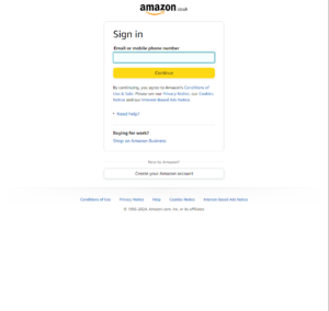
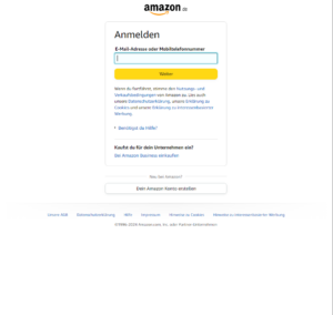
Take Amazon, for example: when localising their website, they made sure to allow enough space in their dialogue boxes for different languages. Compare the versions below of the sign-in section on the homepage (in English, German and Italian respectively):


Here at Creative Translation, we are experienced in multilingual desktop publishing and typesetting. We deal with text expansion and contraction considerations on a daily basis – and can work with you to help make your translated text fit!
2. Appropriate icons and images for your target audience
Always check with in-market native speakers that designs, photographs, infographics, and so on are not unsuitable, or worse – offensive, in the target culture.
Different images will have different responses in each market. An image or icon that is culturally acceptable in the Western world may be considered offensive or inappropriate elsewhere, or simply not relevant. This applies for example – but not only! – to photos of people, which should always include individuals that are representative of the target culture. This approach ensures the audience will more easily identify themselves with the content.
The best way to deal with the visual aspect is to investigate the preferences and customs of the target audience. Our market research services can help with this – for two examples, check out our case studies on Virgin Atlantic and Unilever.
3. Usability and User Experience (UX)
Every brand wants their website to be easy-to-use in all of their target markets, and for their customers to have the best possible user experience.
A key consideration for usability is the direction in which a language is read on the page.
Bidirectionality and UI mirroring
Bidirectional scripts (those that read from right to left but contain some segments – such as numbers and untranslated text – that read from left to right), such as Arabic, Persian and Hebrew, pose challenges for cross-cultural design.
The main difference between left-to-right (LTR) and right-to-left (RTL) language scripts is the direction in which content is displayed. Note that by “content” we don’t just mean text, but also everything else on the page. This is where UI mirroring comes into play.
UI mirroring is a term used to describe the change in text and layout when the User Interface (UI), which was originally left-to-right, is “mirrored” so that it now reads from right to left, and thus becomes the “mirror image” of the original page.
As outlined above, an important point to bear in mind here is that in bidirectional scripts numbers and untranslated text are not mirrored – even if the untranslated text is part of a sentence. For example, a telephone number on an Arabic website, or a URL in English won’t be reversed, they will still read from left to right. (Something worth remembering also when translating business cards from English into bidirectional scripts!)
Global website templates
When choosing a Global Template for your website, ensure it is a flexible one that accommodates all the languages you need it to.
And for all-important site navigation, don’t forget to position your global gateway where it is easy to find! (that is, the list of languages or navigational system directing a user to the different language versions of a website). It is also hugely important to make sure that language names are written in their own language, so that your website visitors can easily locate the version of the site they need.
4. Local taste and Consumer Behaviour
Tastes, trends, and consumer behaviour differ around the world. Compare Western and Asiatic web design and you’ll see that there are noticeable differences between the two. This article by RandomWire explores some reasons why Japanese web design is so different to websites created for the Western market.
Bearing in mind the four key areas above, it’s clear that in order to have a positive impact on the user, brands need to research each target market and understand how cultural factors may affect web design.
And it pays to get professional help.
If you are looking for help with website localisation, translation, typesetting or market research for your new target markets, get in touch with us today.
Send us an e-mail to info@creativetranslation.com or call our office on +44 (0)207294 7710 and we’ll be happy to help.


